Friday 3 June 2011

Portfolio Exam 201

Photographs don’t really do justice to the portfolios so this is going to be a text based blog post but I wanted to use the opportunity to make some general comments about the portfolio exam. We saw some really high quality work and portfolios that really improved upon the project work in terms of presentation and design development. We also saw a few which we felt let down the work and examples of portfolios which were less than the sum of their parts. There were a few things I wanted to highlight, particularly as I believe that the portfolio examination is likely to become an increasingly important part of the way in which design is assessed. The portfolio is also your key to employment!

SELF REFLECTION

We saw various ways of tackling the self reflection part of the portfolio – including very narrative descriptions of the projects to skills audits. Many of you picked up on the need to develop specific skills like CAD, or drawing and presentation etc. Whilst these were valid comments the best self reflections we saw discussed in much more depth your design method. Do you make enough models? Are you the sort of person who tries to entirely formulate the design in their heads before committing to paper or card? Do you feel like you can visualise 3D space? Do you have a library of great architects and buildings in your head? How do you want to develop your design method? These are the sorts of questions you need to ask yourself. Being better at AutoCAD helps – but it won’t make you a great architect. A number of you also contacted me because you had mislaid your feedback sheets. As I explained this didn’t affect our assessment of your work but it did indicate to me that you had discarded the comments that were made in your reviews and the nature of the mark you were given in terms of the assessment criteria. With every assessment you do you should be thinking about why you got the mark you got and what you might do to improve for next time.

PROCESS

The best portfolios were those which were full of development work and where each project told a story about the methods used to develop the design. Good portfolios tended to be full of photographs of models and accompanied with sketchbooks (often 1 per project bulging) with ideas clippings, sketches…etc. Weaker portfolios tended just to have the final projects – with little evidence of development work. For me there are two messages here. One is that the best projects emerge from the most active minds – those people who just create – even if some of that creation leads to dead ends. Second is that it is really important to demonstrate your process. There are no absolutes in architecture and when we look at your design work we are measuring your work against your own expectations and what you were looking to achieve. I was shown around some of the third year work recently where even when the work on the wall didn’t quite match up to the high standard of the students thinking I was shown extensive development work which made up for what I couldn’t see in the final presentation. Its very important therefore that 1) You have a clear design method and 2) You find ways of communicating it as part of your portfolio.

PRESENTATION

We tended to look through the presentation at the quality of the work but there were many and varied ways of presenting the portfolio ranging the professional to the…well…less than professional. Something we observed was that it was much easier to look at the portfolios of those who didn’t use plastic wallets. This will be rather galling for those who spend hundreds of pounds on plastic wallets but it was perfectly reasonable to mount the work on card and stack the sheets loosely in the portfolio file. Some things that you might want to avoid when you put future portfolios together:

Artschoolishness

A tendency, particularly for students who have an art school background, is to pack every page full of graphics and to have, for example a page with 6-10 charcoal drawings with no labels or explanation. There is also a fine line between self expression (using the portfolio as a way of expressing your personality and style or work) and messiness and lack of clarity. Don’t be afraid to let drawings breath – its not unusual to mount an A3 sheet on an A1 board to highlight work that you are prod of and deserves a bit more space. And remember to label things – as tutors we were familiar with your projects but this is not the same for everyone who looks at your portfolio (particularly the external examiner and potential employers).

Fiddleism

We discussed this at the beginning of the year and it crept back on some of the work we looked at in the portfolios. By Fiddleism I mean the tendency to over elaborate the peripheral parts of your presentation – to add many different types of font, to add frames and swirls on the sides of the image or labels. The most impressive portfolios presented the content with clarity and simplicity – keeping single fonts and styles for labeling and not competing for attention with the images.

AND FINALLY…

This marks the end of this blog post and the end of your 1st year of Architecture School. On behalf of all the teaching staff who have had contact with you this year let me congratulate you on a great year and say that it has been a great pleasure teaching you. We may have contact with you again in later stages of the degree but we will follow your career with interest.

Thursday 2 June 2011

Fragments of Invisible Cities 2011

This year’s work has been, as usual, of a high standard, however, I think that there are some good news stories and some bad news stories.

Overall the quality of the AutoCAD work was much better than I have seen before. A large number of you scored in the 60s with many getting 1sts for this component. The clear message that I got from the AutoCAD work was that if you knew how to draw you know how to create CAD drawings. Common mistakes were not using line weights or using line weights badly (i.e. making the walls a fine line and the toilets a heavy line) and exporting the drawings at low resolutions so they appeared pixilated. In fact poor resolution was a common problem across all the exercises with both Sketchup work and Photoshop work sometimes printed at 50 dpi or less (bearing in mind that we suggested that you print at 200-300 dpi).

SketchUp work was generally good and it was fun to explore your imaginings of your invisible cities. My only concern was that a number of you seemed to rely very heavily on models imported from Warehouse and although its wasn’t always possible to verify which were you own models and which weren’t (I gave extra credit to those people who listed the models they had used from elsewhere). There were a number of commonly used building types which gave the game away.

I think that the weakest aspect of this year’s submission was the Photoshop work. I think a few people had taken the brief to demonstrate their technical skills to the extreme without thought to the output of what they were doing and I was often greeted by muddy, confused, low resolution, filter heavy work. In some cases the printed output probably surprised people when it appeared darker and much less clear than on the screen but in other cases I felt that the Photoshop part of the work was rushed and underdeveloped.

I think the general rule for all these exercises when you get your mark back is that if you are getting a 2:1 or above (60%>) then you are of a good standard for next year but less that 60% you should spend some time over the summer developing your skills.
In previous years I have given prizes (all be it with no actual prizes ) to the best work and I wanted to celebrate some of the hybrid graphics here and explain why I liked them.

BEST OF THE YEAR – Rumen Dimov
My Favourite image of the year was Rumens Cover graphic (which was also used on the cover of his portfolio). While the image seems very simple it is composed of 8 different layers with subtle changes to lighting and contrast and light and the best use of filters I’ve seen. The result is seamless and beautifully framed.


MOST DISNEY LIKE – Michael Pybus

One of the thinks that surprised me about many of your interpretations of Invisible Cities was how conservative they were. But, just occasionally I was something that really explored the full fantasy potential of the project. This image by Michael Pypus could have come straight out of a Disney animation. It consists of more than 24 layers with some very subtle effects using highly transparent layers added on top of another to achieve images like fog for example. This sort of image is really not easy to do and you can’t get this kind of output from a 3D renderer.


MOST LIKELY TO BE FOUND IN PIRATES OF THE CARIBBEAN 4

This is the kind of thing that you would never get away with in the design module but without the constraints of style or, indeed, gravity Muyan has created something which could either be a computer game level or the set of a movie. The work was also supported with some really nice preparatory drawings.


MOST SOPHISTICATED MODELLING: Ruta Austrina

While this model looks deceptively simple its worth noting that each of the bricks in the arch is a separate element and the model is precisely organised to allow all the cables to be properly joined up. I like the Lawrence of Arabia theme in the hybrid graphic as well!


MOST ACCOMPLISHED TEXTURING AND LAYERING – Rachel Leatherbarrow
Rachel worked with a combination of textures and drawing directly on to the models to create these ruins and this was accompanied by some simple but very affective Photoshop work to add some depth to the shadows and hint at the ghostly presence of people.


MOST…CYBERSPACEY: Matthew Pratt
With digital graphics and rendering there is, what we might call, a digital vernacular. Computers are very good a producing complex surface geometries and highly fluid/metallic textures. For this exercise Matthew really played with these techniques and the results are exciting. A word of caution though, unless you can work out a way of building out of pure mercury real buildings tend to be made of material stuff with seams and joints and it’s important not to get seduced by the purity of shapes and surfaces you can achieve in a computer.


Thursday 28 April 2011

Campus 2021: Feedback for 2011

I’ve finally got through tallying the marks and finalising the grades which should be ready to pick up when you get back (wait for an email form Carolyn to tell you when). I’m afraid that this blog post is also imageless at the moment because the photographs I took on the day have been corrupted in my camera so will have to wait until I receive the A3s and update later.

Overall we were very impressed with this years work – particularly since this is the first master planning type exercise you have ever done and the first time you have been asked to do serious site analysis. Most people treated the exercise with huge enthusiasm and professionalism and the results showed. The marks, in keeping with the tradition of group projects where generally not middling with no one really excelling into the high 70s or 80s but very few dropping significantly below 50. As usual though, as long as you have passed and learned something that’s good enough for us!

This is not the best medium for extensive feedback but just a few notes made by the reviewers which refer more generally to the overall assessment. I also encourage you to go back over the comments I made to last year’s work which could also refer to much of the stuff we saw:

Selection Selection Selection!

By far the biggest challenge we saw was in the selection of the images used in the A1 presentation. There were a number of instances where we saw A1 presentations which we judged to be of 2.2 or even 3rd standard where the supplementary work submitted was easily of a 1st standard. The instruction to reviewers was to mark ‘what is on the wall’ and while the supplementary information was referred to we took the decision to stick to that rule. Remember that you wall presentation is there to both show your design but also to argue for why it is the way it is. In this instance (given the competition context) you really needed to edit your site analysis in such a way to persuade the audience that your design decisions have been made for the right reasons.

Understanding 3D

A common problem was mistaking the idea of a masterplan as only a plan. The key to getting this exercise right was to understand that you are planning for 3-dimensional volumes on a 3 –dimensional site. The best proposals were those that used section and/or 3 dimensional studies to give their building proposition weight and volume and to tackle issues of access on multiple levels.

Oral Presentations

It was noted by one of the reviewers that in many cases those for whom English is a second language did better in the oral presentation that native English speakers. We put this down to the fact that often overseas students tended to prepare better taking notes and structuring their presentations where as often native English speakers relied on their own improvisation so the story they told tended to be much less clear, disordered and also untimed. The oral presentation is very important and you should structure your story logically and make sure that you practice what you intend to say before time and make notes of the main points you want to discuss and their order.

Group working

Inevitably group working is challenging and I think it would be accurate to say that most students don’t enjoy group work projects. Despite this working in groups is a reality of virtually all professions and a key skill we must develop to give you professional accreditation with the RIBA. This means that you will do at least one group work project (or project with a significant group work component) every year. The groups that seemed to work best were those where roles were clearly assigned with each member given specific responsibly but with an overall sense of direction. Groups which worked less well tended not to collaborate but each take a section of the design each or where there was a lack of leadership. There were a couple of instances where I felt that group members were passengers in the process and did very little. We have decided to give everyone in all groups the same mark but I think there are a number of people who need to ask themselves whether they deserve a grade earned by other people in the team.

So now to the good stuff – the winning entries. This year I decided to give three prizes which reflect the way we characterise different projects and shows that quality is not necessarily done on a single dimension. So the prizes are:

COMPETITION WINNER

This goes to Group 33! It’s interesting to note that this was not the highest scoring design (in fact it got a high 2:1) but a combination of a very high level of presentation (elements of which we felt where clear to a non-professional) and a thorough 3D knowledge of the site meant that this was a clear competition win. We also felt that this was the convincing attempt we saw to join up the museum to the rest of the Campus and created a really exciting new public space.

BEST MARK

The best mark went to Group 31. The overall design was, by far, the most accomplished we saw with extensive background work and a very well worked out master plan – presented beautifully and with clarity.

TUTORS FAVORITE

You might think that the tutors favourite would get the best mark but not in this case. I think for its sheer audaciousness in creating an entirely new civic core for the city and the extraordinary level of research that went into coming up with the design we wanted to give a special mention to Group 32 for making us excited about the master planning exercise and really understanding what it could do for the campus.

Friday 4 June 2010

Prizes for Memory Theatre Competition


Although the average grade was down from last year (predominantly because of the AUTOCAD stuff), the very best work was phenomenal this year. The range of interpretations and the ingenuity of both design and presentation were, at times, breathtaking and made this the most enjoyable marking experiences I have had. There are no official prizes of course but the selection of the best work is shown, with the winners, below. The judging has been so tough this year that I have changed my mind 10 or 11 times since making the shortlist. In the end I have decided that the only fair thing I can do is to choose two winners and publish them both in different chapters of my book “The Architecture of Information” which will be published by Routledge in Spring 2011.


OVERALL WINNERS FOR BOOK ILLUSTRATION


Ruth Dickie


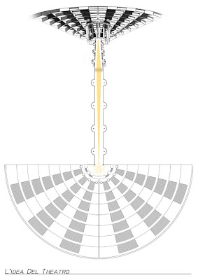
This was a really tough choice! There were at least 5 serious contenders but in the end I kept coming back to Ruth’s Photoshop images. They are deceptively simple – based on the known drawings of the theatre and constructed from simple geometry. However it’s the overall attention to detail which really clinches it. You can feel the weight of the columns because of the shadow who has been added in the detail image and the whole effect is understated. The wood texture is also really well though through and because of this the image works well in Greyscale as well. I certainly wouldn’t have been able to create an image of this quality myself with Photoshop and SketchUp alone. This is the definition of publishable work. Because of the accuracy of the depiction it will be used in Chapter 1 alongside the full analysis of the memory theatre and I’m hoping to persuade the publishers to give a full page for both the detail and overview images.


Neringa Stonyte


It would be heart breaking not to publish this image. This is one of the most impressive pieces of illustration I’ve seen in any student work. The building idea is highly sophisticated and very successful and the steam-punk theme resonates with me. The more you look at the image the more detail you see. My colleagues loved it and suggested that, if I couldn’t find a place for it in my book then I was writing the wrong book! This image works very well with the introductory text of my book and on this basis I have decided to make if figure 1 and place it as a plate on its own at the beginning of the Introduction with James winning work from last year.


PRIZE FOR INTERPRETATION AND RICHNESS OF IMAGE: Emma Chong

Emma’s Photoshop work was another contender and was one of the few graphics which tried to interpret the richness of the memory theatre by adding images and bold colours. The only thing that prevented this from being a winner is the use of found images- I concluded that it would be difficult to get permissions for all the graphics included.


PRIZE FOR CLEAN GRAPHICS AND COOL CONCEPT: Jonathan Jones


This was a really interesting idea. Using the basic CAD and Sketchup models and linking them together so that they read in conjunction with one another. There is an almost Escher like messing with perspectives here. The image as reproduced in the blog doesn’t really do the original justice. The only problem was that the level of detail was likely to be to high for the book illustration where the print size is closer to A5. But I really like this graphic and would even consider it for the cover.


PRIZE FOR MOST BROODING: Alicea Rose Berkin

While probably too dark convert into black and white for the book illustration this caught my attention as a really stand out piece of graphic design which would have gone well with last year’s winner. The SketchUp model is solid here and I really like the inclusion of the plan at the bottom. There are 6th years who can’t do this sort of graphic.


PRIZE FOR BEST OVEARALL PRESENTATION: Emma Kirk


Photographic images often look good on black backgrounds and Emma used this principle to very good effect in her presentation. The reproductions don’t really do it justice at this scale but I have also I have included a shot of her Sketchup model. Notice the use of a mist effect to give more depth to the image. This was a really sophisticated piece of work.


PRIZE FOR MOST ARCHITECTURAL: Jaewon Kang

Jaewon envisaged his memory theatre as a real building integrated into a park like environment buzzing with people. The real triumph of this work is that he has developed collage techniques of integrating people, activities and contexts into his images which will be highly applicable in future design work.


PRIZE FOR MOST DIGITAL: Richard Breen
OK – so I’m really stretching the prize categories now but I had to include some examples of Richards work. Richard has envisaged the Memory Theatre as a digital archive and the themes resonate with my book. Most of the images are subtly executed and there is a lot of experimentation evident in the Photoshop layers and he’s managed a painterly feel by subtle use of transparency and wire frames from the model.


PRIZE FOR STUDENT WHO HAS CLEARLY LOST HIS MIND BUT IS USING HIS PREDICAMENT TO GOOD CREATIVE EFFECT: Nick Barstow

What do I say about this work other than I’m sure there is method in the madness – although I can’t find it. This was an extraordinary piece of design and graphics. I don’t know where this building comes from but I was bowled over by an hugely original graphic style. There is a science fiction genera waiting to be invented just so this building can be used as an illustration.


PRIZE FOR STUDENT WHO HAS CLEARLY LOST HIS MIND AND FOR WHOME THERE MAY BE NO RETURN: Frederick Jackson

To be fair to Fredrick this was one image among many other more composed images of the memory theatre it stuck out to me. I think perhaps it sums up my feeling when the making was done…

Tuesday 18 May 2010

Best Work from the Reading Places Project

The following text gives an a few examples of the best work we encountered across the different categories of assessment for the Reading Places project. There are inevitably too much good work to include everything here but these should give you an example of what we were looking for and hopefully some useful advice for the future. Apologies for the relatively low quality of the images used here – they were taken from my phone and have inevitably lost some resolution being presented in this format.

PRESENTATION AND COMMUNICATION

One of the real significant changes from the work I marked in Project 1 has been a general increase in the standard and professionalism of your presentations. For many groups the oral presentation was well organised and clear and targeted for an audience. The key to this is both preparation and having a structured narrative which follows the design process from context and concept to general strategy. In most cases this was also backed up by an almost professional level of graphical presentation. Where there were problems with the overall level of presentation, this tended to be because of relatively simple mistakes like missing labels and titles. Most groups experimented with computer graphics for the first time with many people opting for multimedia presentations using a combination of Photoshop, SketchUp and AutoCAD work. This experimentation often had mixed results as it was acknowledge that what people saw on the screen wasn’t what appeared in print. This is a really important lesson and only comes from practice.

My prize for best presented work is shown in the images below. Although there is, perhaps, a little too much information on the page it is clearly presented and the quality of the graphic design is such that all the labels can be read and the diagrams can be read as a sequence and used to reference the main master plan.


One distinction we made in the review is between communication and presentation. Whilst we saw a number of 1st Class presentations not all of them were good pieces of communication. By presentation I mean good page layout, appropriate selection of media and graphic design techniques, neatness etc. A great presentation however does not necessarily mean that it is an effective piece of communication. The key to getting the communication right is to make sure that you select the appropriate images and that all the drawings read in unison – i.e. they reference one another. Common problems where that graphics had been selected because they looked good rather than that they helped tell us anything about the design Conversely many of the less successful work in terms of presentation where better in terms of communication. Ultimately our focus is on the design outcome and you need to give us all the help that you can in terms of both presentation and communication. Here I will concentrate on the main Master Plan Graphic.

This image shows a reasonably successful central master plan graphic. The key things to note here are the clear distinction between the proposed and existing buildings and this is further helped by clear labelling.


This was the only hand drawn master plan we saw and demonstrates the extra level of control you have with hand drawn graphics in terms of the quality of line and the subtlety of fill. Again the built intervention is clearly differentiated from the existing context:

Control over the graphical presentation is very important when you are using other people’s drawings – particularly things like OS maps. Many people used Digimap output as the basis of their presentations but these maps were often reproduced at a level of detail that was wrong with unnecessary labels and supplementary information that cluttered the final drawing. I’ve chosen this plan because of its clarity and that it is stripped back to show the right level of detail:

ANALYSIS AND SYNTHESIS

Like communication and presentation it is important to separate out analysis and synthesis. With only one or two exceptions the analysis work we saw was of a high standard (helped in part by your use of the Space Syntax document). Synthesis, however, was less successful in many cases either because it had been done but not presented properly or because there was gap between the analysis and design phases of the project. I use the work synthesis to describe the translation of analysis data on the site into the framework for design. A significant example of this is shown in the image below where the column of diagrams on the right represents site analysis before the proposed intervention and the images on the left represent the effect of the proposal:


In many, if not the majority of cases the critical pieces of site analysis and synthesis were hidden in the supplementary material. When doing the assessment work we found a treasure trove of hidden design work much of which we felt could be selected for the A1 sheets. The problem with sorting through the supplementary material when attempting to make an assessment of this work is both the time it takes to find the relevant information in piles of other exploratory work and then to try to tie it in to what we see on the wall. I felt on a number of occasions that we might have awarded a higher degree class if the appropriate analysis material had been shown with the final design. That said I include a few of the many examples that we found of excellent supplementary work and a couple of examples of the work we found hidden in the extra material:


Another aspect to consider in analysis and synthesis is your understanding of the brief and the clients needs. One particularly effective method used by 2 or 3 of the groups was to start their presentations with a discussion of the aims of the university and, in a number of cases to track down and read the universities strategic report. There is inevitably ‘hidden’ information in these documents and understanding the clients culture and aspirations is an important aspect of being able to design effectively. Group 7 for example wanted to highlight their translation of the universities aims an objectives along side their site analysis:


DESIGN OUTCOME

If you get everything else right then the design should emerge naturally. Easier said than done of course but I don’t think that we saw a single ‘wrong’ answer to the design brief. Where marks did get lost tended to be in cases where either the design solution was not properly rationalised in terms of analysis and synthesis or where there simply wasn’t enough declared – i.e. we couldn’t see what the final design strategy actually was. I think one of the key challenges was selecting the appropriate level of detail. Whilst this isn’t much comfort to you now I have examples of good work from this year it will be easier to brief next years students! There was one design outcome that stood out to me for its clarity and ingenuity. The best mark went, without any doubt, to group 26. It was a difficult strategy to choose the site to the north of the campus but this group managed to produce, not only the most effective graphical presentation of anyone but also the most persuasive argument for the development of this patch of land.

It’s a winner on both marks and for the competition. No prizes I’m afraid but a great start for next year!


Thursday 28 May 2009

Prizes for Library of Babel Competition

There were some truly excellent pieces of work in this year’s submission for the Communications Course. And I’m hoping to have an exhibition of the best stuff next year. In the mean time I’ve taken some of the best overall examples, mostly from the final exercise and awarded prizes by category. There are of course no actual prizes apart from the overall winner who’s work will be published in my book “The Architecture of Information” which will be published by routledge in Spring 2011.

OVERALL WINNER FOR BOOK ILLUSTRATION: James Britton
This one was a very difficult choice and, in the end I chose 4 finalists, of which James was the outright winner with this spectacular view of his highly detailed and carefully through out Sketch up Model with very subtle photoshop work. It will work well in print and I can’t think of a better start to the book:

RUNNERS UP FOR BOOK ILLUSTRATION:

Paul Wood (special mention for understanding the computer as a medium and not just a tool).

Sorry Paul I know you were gunning to win this and it was good but not quite what I wanted for the book in the end. This work was however among the most sophisticated I saw using very advanced modelling methods in SketchUp and attempting algorithmic design. The presentation was also peerless with very simple but highly effective layouts and complete descriptions of all the tools and methods used.


Olga Gogoleva (special mention for most illustrative illustration with reference to the story)
This was a real contender and wouldn’t be out of place as a children’s book illustration. A successful attempt to render light and shadows really made this stand out and was a favourite among my colleagues.
Kevin Vong (special mention for best overall photoshop work)
These images would have been certain for the book illustration if I had been able to print in colour, unfortunately they worked less well in black and white. However, this was the best Photoshop work I saw . Subtle but actually quite complex in terms of the number of layers involved and the neon glow of the strip lights mean that this could come straight from an Anime version of the Library of Babel.


OTHER PRIZES
BEST OVERALL DOCUMENT + BEST AUTOCAD: Robert J. Arthur

This document represents a phenomenal amount of work, care and attention to detail throughout. The AutoCAD work was the best example I looked at and the SketchUp model was carefully thought out and made excellent use of highly modified objects from Google Warehouse. Rob set the benchmark with this work.


BEST USE OF TRANSPARENCY AND LIGHT: Simon Brook
Many people attempted this style of transparency and light but few accomplished it on this level. There are approx 20 layers in each of these deceptively simple images all of them with different levels of transparency blur, subtle gradients and filters. It takes real care and experimentation to do this:


BEST INFO GRAPHIC: Robert Gibbs
Perhaps because of the gothic and atmospheric edge to the short story very few people attempted the info graphic approach we discussed at the beginning of the Photoshop Workshop. Robert did use this style, however, to very good effect. This is an excellent model for how to use SketchUp models as part of a final presentation and wouldn’t be out of place in a 6th year portfolio exam. There is nothing technically difficult here it’s just well thought through.


MOST APOCALYPTIC: Tom Farmer
Toms presentation was undoubtedly designed to give me nightmares with scenes that could have come from the classic SciFi films Lawnmower Man or TRON and whilst graphic flair sometimes got in the way of communication I couldn’t help but admire the consistency of presentation and Toms ability to Mix media types seamlessly.

BEST USE OF LENS FLARE: Gabriella Smith

Gabriella produced one of the most graphically sophisticated Photoshop documents and if Architecture doesn’t work out then graphic design certainly will. If there is ever a new novelisation of the Library of Babel this would be its cover.


THE MOST LIKELY TO APPEAR IN MONTY PYTHON: Jake Winter
Some people tried to go surreal with varying degrees of success but these hit the mark. Again this is all about attention to detail using colours bright colours deliberately and subtly. Terry Gilliam would be proud.